Some interesting UI design history from Jack Wellborn at Worms and Viruses:
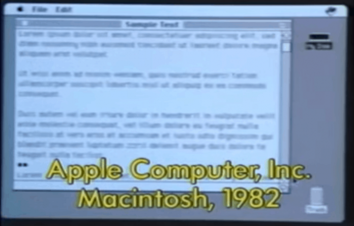
While watching the video, I couldn’t help but notice two snippets at the 7:36 mark from 1982 about scroll bars.
First, an Apple engineer shows how scrolling works in the Lisa, followed immediately by a similar demo from Xerox. This juxtaposition immediately struck me as interesting because Apple detractors are quick to reference Xerox Parc when dismissing the graphical interface innovations of the Lisa and Macintosh. While there is no denying Xerox’s influence, these two snippets perfectly illustrate massive amounts of design and refinement championed by Apple during that era. Read for yourself.
The instructions from the Apple bit:
To scroll by one line, click in an arrow. To repeatedly scroll a line at a time, hold the mouse button down in an arrow. Note that the arrows point towards the data that will be exposed when pressed. To scroll by one windowful, click in a grey region. To repeatedly scroll by windowfuls, hold the mouse button down in a grey region. To scroll immediately to a desired location, press in the thumb, drag to the desired location and release. To abort the scroll, drag out of the scroll bar before releasing the button.
Now the Xerox Parc segment (emphasis mine):
The Cedar Document Editor [Kiyoga?] provides vertical scroll bars to the left edge of document windows. When the cursor enters into a scroll bar, the scroll bar darkens and the cursor indicates that scrolling is available. Each of the three mouse buttons corresponds to a scrolling operation. When a mouse button is depressed, the cursor shape indicates the enabled scrolling action. When the mouse button is released, the command is invoked. Scroll up moves the line of text adjacent to the cursor to the top of the window. Scroll down moves the line of text at the top of the document window to be adjacent to the cursor. Thumb causes display of the location in the document corresponding to the vertical position of the cursor in the scroll bar. The grey rectangle indicates the location in the document which is currently visible.
People who think UI design is easy might think the differences here are trivial; those who know that UI design is difficult know otherwise.
Source: Daring Fireball
[contextly_auto_sidebar id=”PtEN8rNKRg3SXbjMaanfd8oTZfuzV4or”]


